


Uber’s had a bit of a rebrand
By launching a new logo, Uber is attempting to make its brand more recognisable across its new and varied platforms


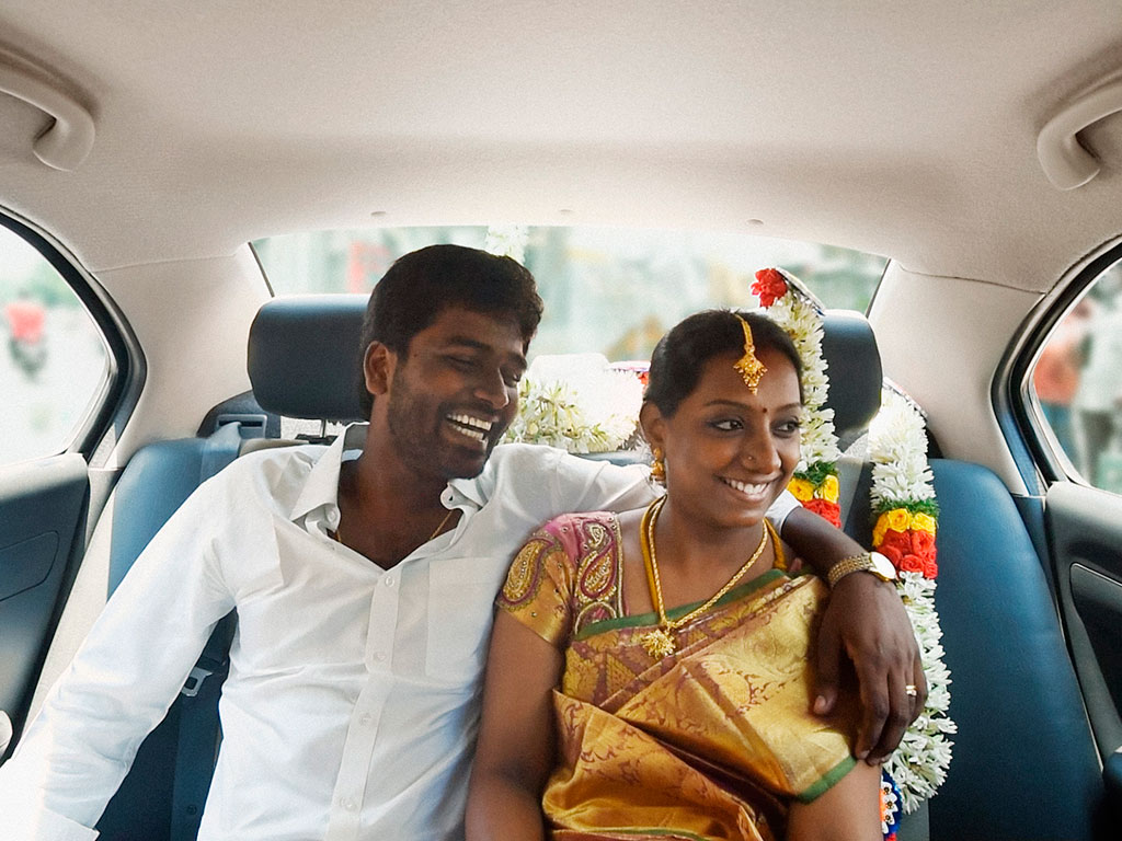
An Indian couple take a ride in an Uber car. The colours in Uber's new design will vary between regions; in India, they will include reds, greens and yellows.
The popular ride-sharing app Uber has rebranded itself. When the company’s millions of users open up their smartphones, they will be greeted by an updated, colourful app design and new logo. The redesign is part of a larger effort by Uber to change both its identity and make its brand more recognisable as it expands into new areas of transport.
The new design features a circular icon in the centre for riders, and a hexagonal one for drivers. This will replace Uber’s previous logo of a silver or white U. The new circular icon is being tediously referred to by Uber as “the bit”. According to a press release: “One of the big changes over the years is that Uber no longer moves just people; we’re now moving food, goods, and soon maybe much more. With the potential for many apps with many app icons, we needed one approach that connected them all.”
The redesign is part of a larger effort by Uber to change both its identity and make its brand more recognisable
The new multicoloured design, upon which the so-called bit is stamped, will now vary between regions, instead of the firm’s previous uniform black. In the US, the design will include dark teal, while China’s will incorporate red. As Uber said in the press release: “In Mexico, we were inspired by Mexican pink and the patterns in the local tiles; in Ireland, from the Georgian architecture and the lush greens; and in Nigeria, from the ankara, which came up again and again because of its bright colours and beautiful geometric patterns.”
In an interview with Travis Kalanick, the CEO of Uber, Wired noted the rebranding process had been years in the making. Kalaknick, the article said, “worked alongside Uber design director Shalin Amin and a dozen or so others, hammering out ideas from a stuffy space they call the War Room. Along the way, he studied up on concepts ranging from kerning to colour palettes. ‘I didn’t know any of this stuff’, says Kalanick. ‘I just knew it was important, and so I wanted it to be good.’”.